Personal Branding
Branding, Illustration, Animation
Overview:
I wanted to create a new brand identity for myself that was both playful and professional as I moved into freelance full-time. Not only did I need to create a static assets such as a logo design, but also a range of visually captivating animated assets to establish myself as primarily a motion designer.
Mascot Design:
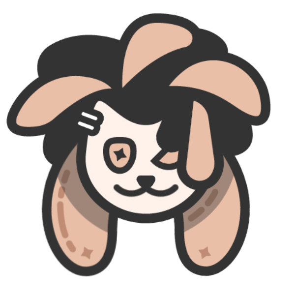
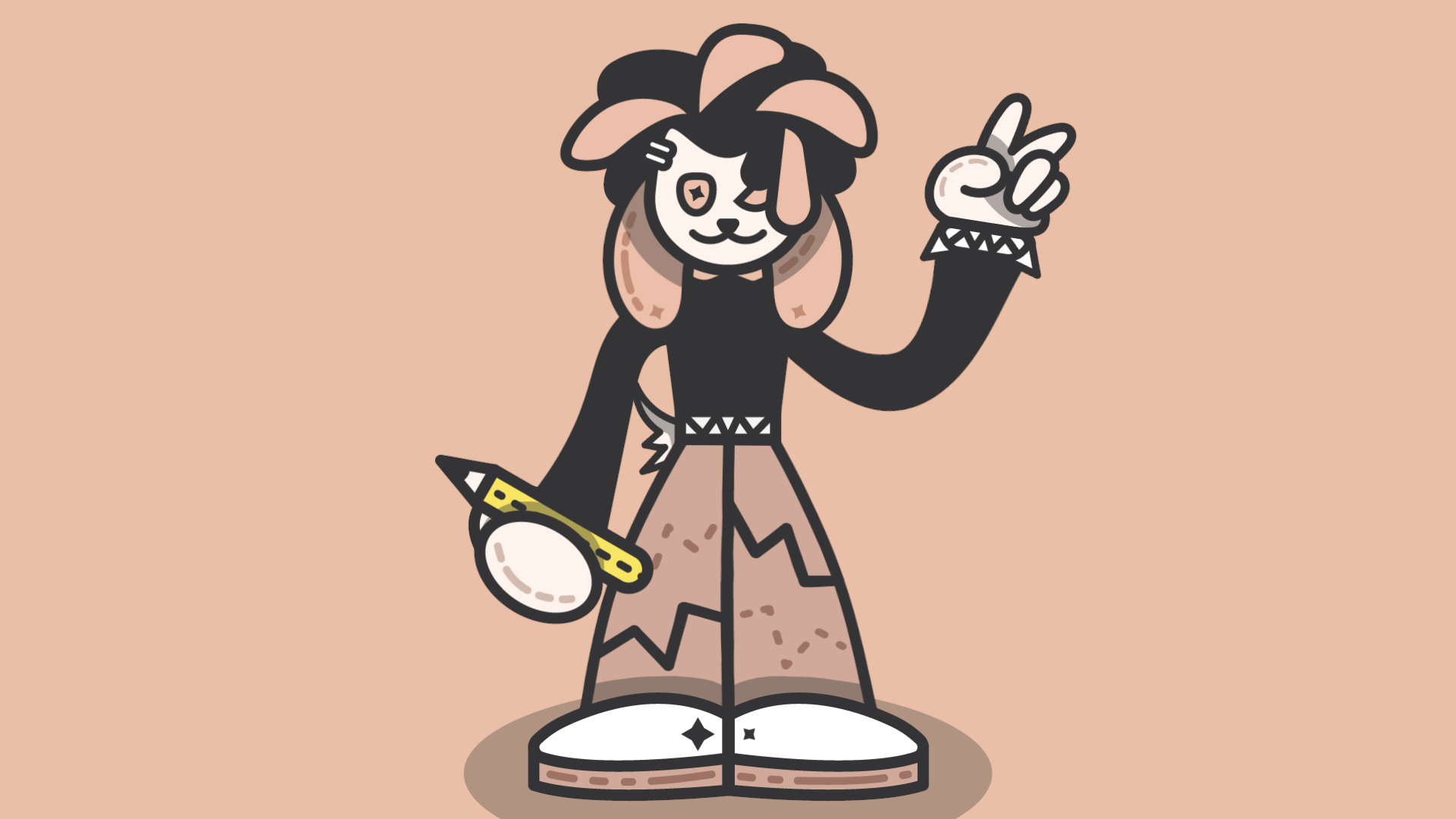
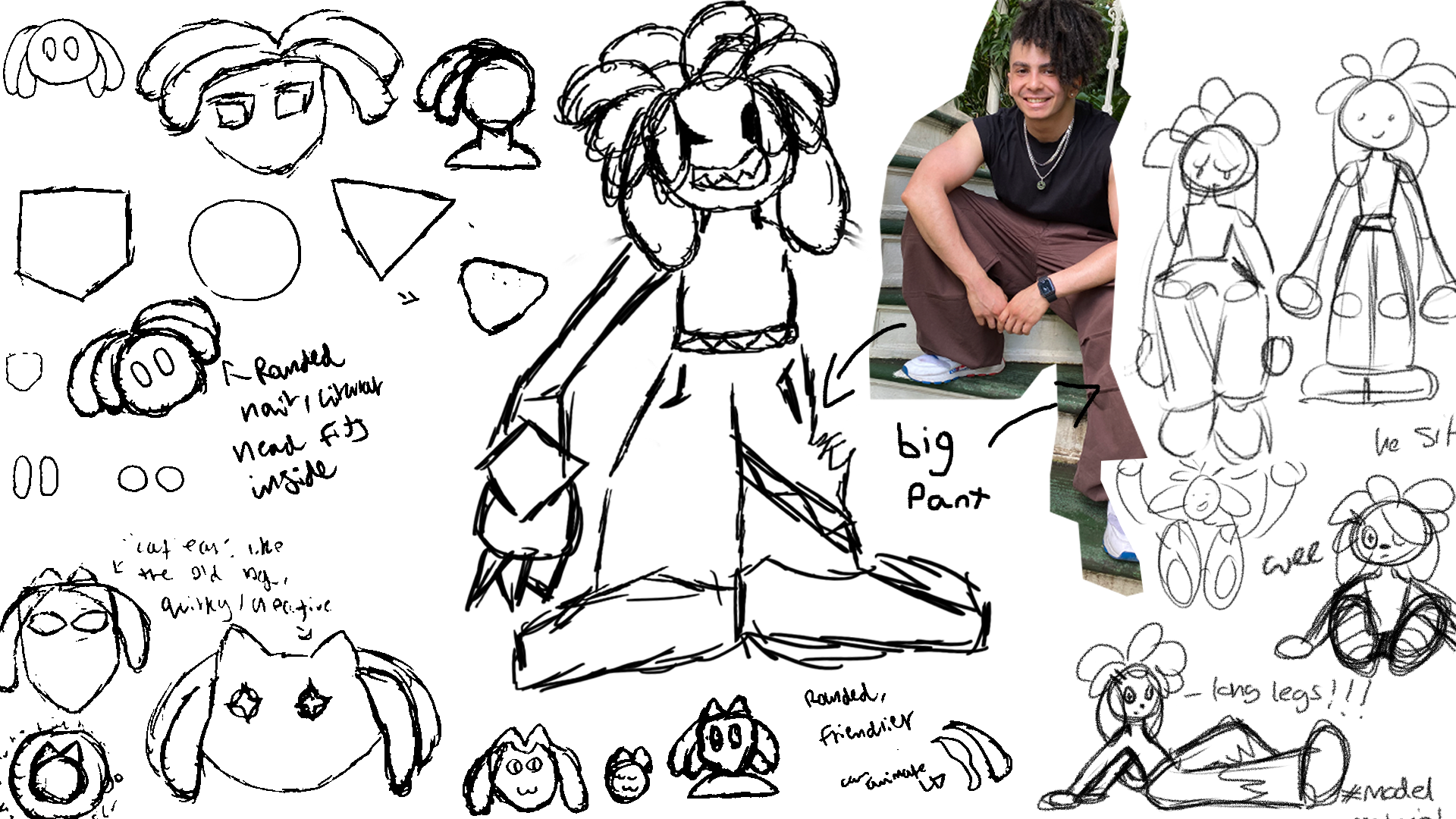
Introducing: Duster! Throughout my years as a designer I've always had a character-based mascot as they've always resonated more with me than solely typographic logos, so I wanted to create a new character that was able to express both my illustrative style and my personality. The design draws inspiration from my personal fashion preferences as well as from some of my favourite design aesthetics, mostly hailing from videogame mascots in the early 2000's.
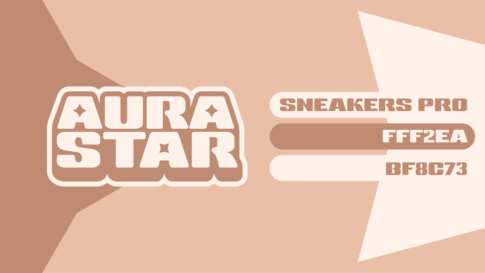
Logo Design:
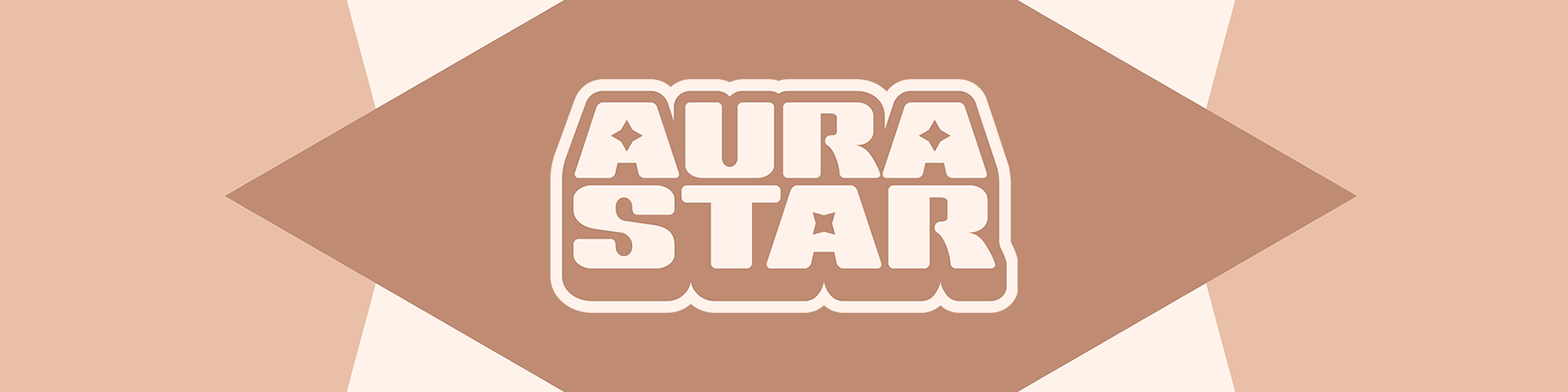
Furthering the early 2000's design inspiration, the logo sports heavy outlines and a thick drop shadow with 4-pointed stars occupying the counter of the letter 'A'. This is all done while retaining my own personal style with the use of flat colours that match the colour scheme of the mascot and very smooth, rounded edges.
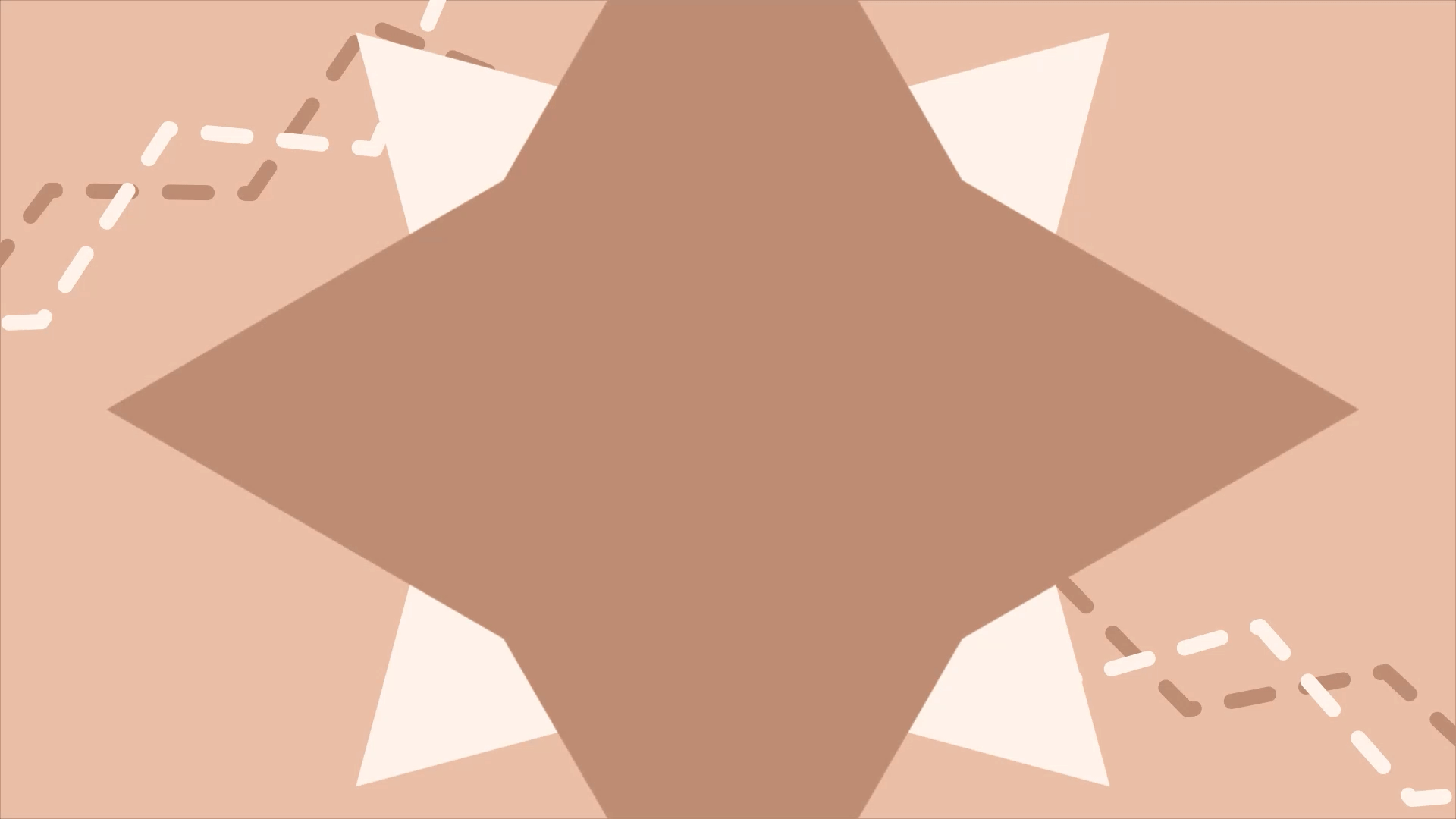
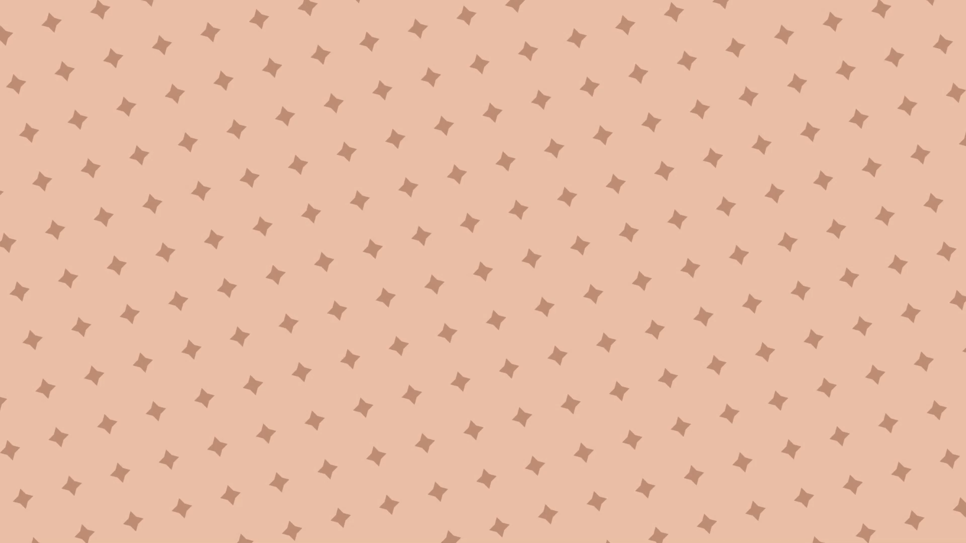
Looping Background Graphics:
One of my core foundations as a motion designer is creating seamlessly looping visuals. While only using elements present within Duster's character design I was able to create supporting background visuals for use in both branded motion graphics and any other additional video projects I created online.
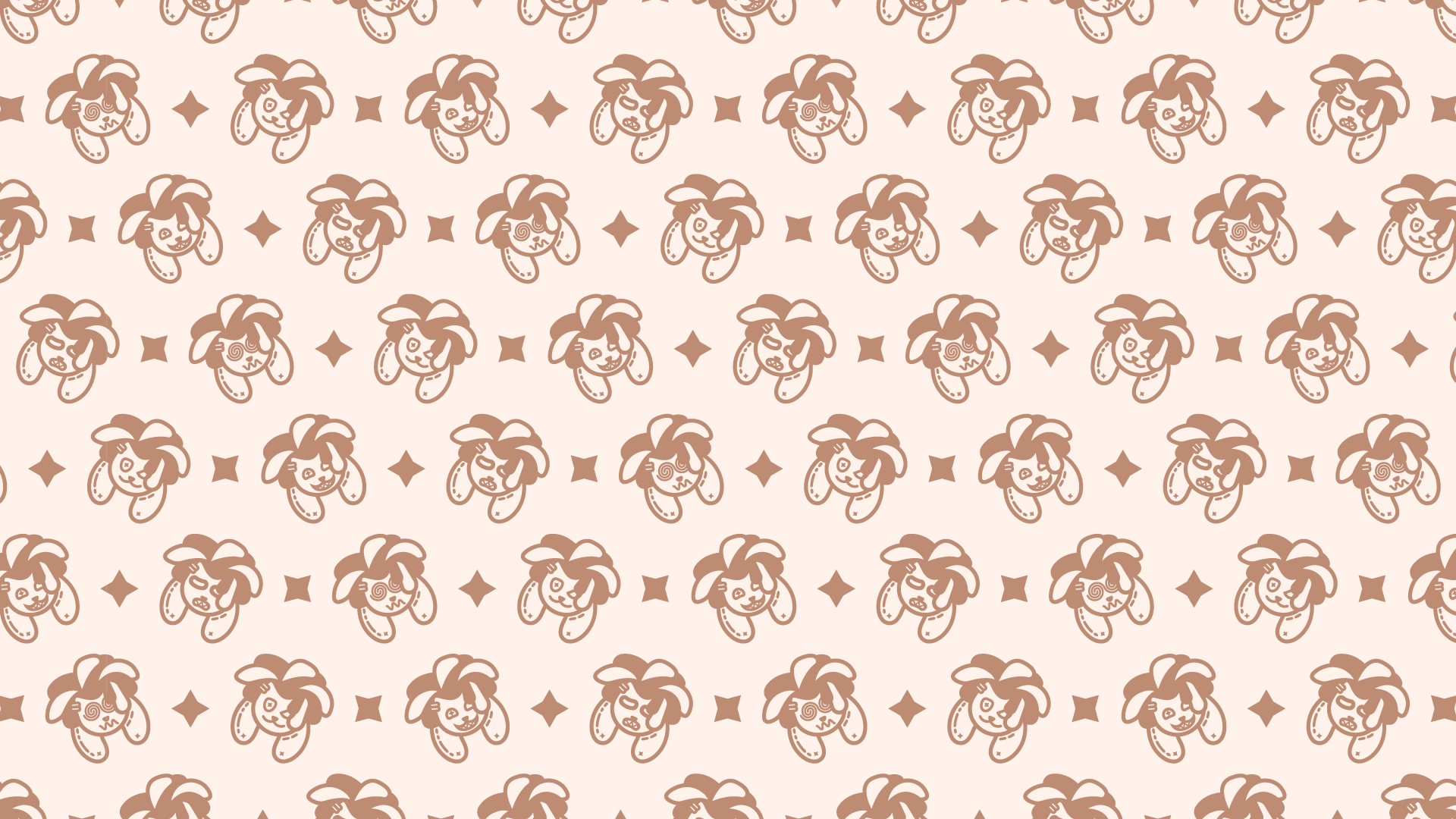
Pattern Design:
I wanted Duster to be as expressive as possible and be able to be used in any scenario so I created a range of different emotions in Illustrator and turned them into a fun pattern to be used for my online art store. I also ensured that the outlines in the illustration were bold enough to be suitable for print so when the brand expands to creating physical media all of the assets were already print-ready.
3D Model:
I wanted to explore how Duster would work in 3D to both brush up on my 3D modelling skills and to expand my knowledge of character animation. This was the first character I made in Blender from start to finish and I gave myself a 2-day deadline to polish it as much as possible in the given timeframe - this massively improved my efficiency in both the 3D space as well as helping establish how Duster would work in the real world for when I inevitably turn him into a cute little plush toy!
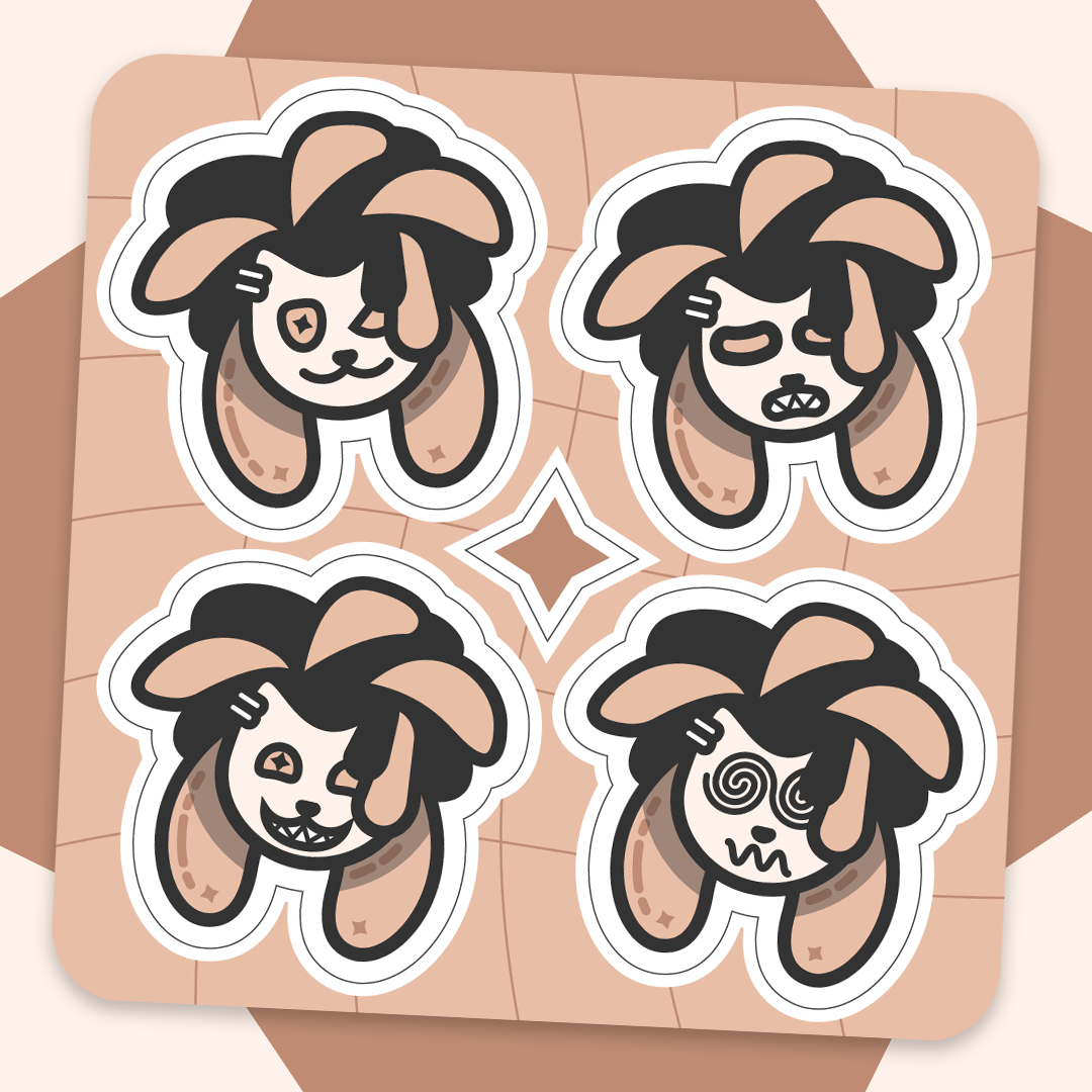
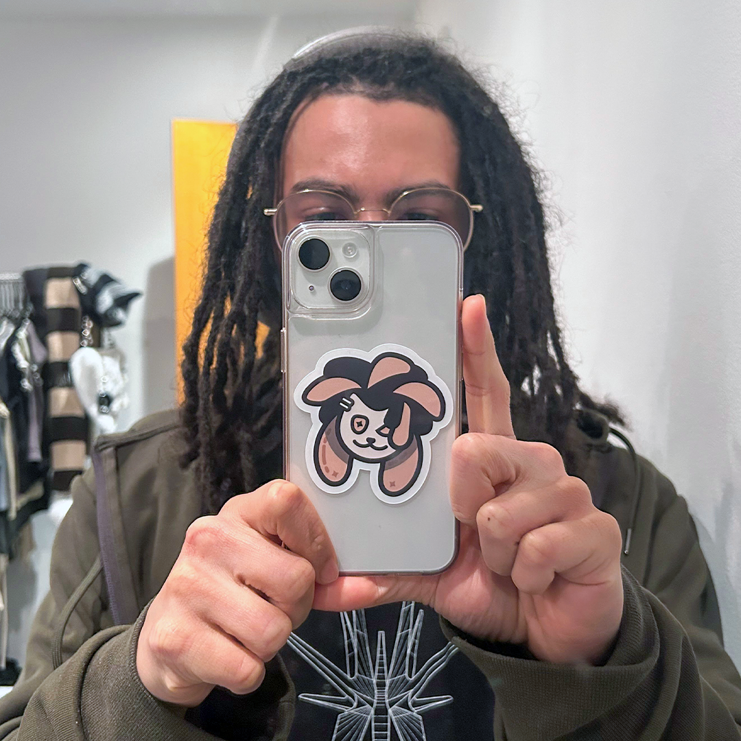
Sticker Sheet:
When opening my online print store I wanted to offer a sheet with a range of Duster stickers as by this point my client base & online audience had grown fond of him. Designing Duster with CMYK in mind allowed for a seamless transition from screen to printed page.
Custom Stamps:
As my branding at its core is meant to be fun, I thought a nice way to add some visual flourish to print orders was to create a new design with a custom stamp of Duster. The ironic use of comic sans in conjunction with the text being a Seal of Approval helps lean into the fun nature of the Aurastar brand identity.